
Website Navigation Structure: 9 Smart Ways to Improve UX, SEO and Conversions
A website can have strong content, attractive design, and valuable services, but if visitors cannot find what they need quickly, the experience will still feel frustrating.
That is why Website Navigation Structure matters.
Website Navigation Structure determines how pages, categories, menus, links, breadcrumbs, and mobile navigation work together to help users and search engines move through a website.
A well-planned structure improves website user experience, supports an SEO-friendly navigation system, and makes it easier for visitors to reach the pages that matter most.
For businesses, the goal is not simply to create more menu items. The goal is to build a clear path from discovery to action.
This guide explains 9 practical ways to improve your Website Navigation Structure for better usability, SEO, and conversions.
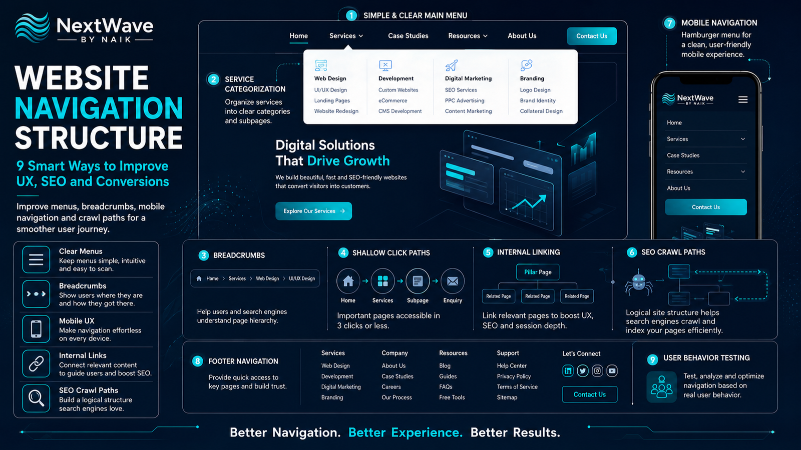
What Is Website Navigation Structure?
Website Navigation Structure is the system used to organize and connect website pages so visitors can move through them easily.
It includes:
- Main navigation menus
- Dropdown menus
- Category pages
- Breadcrumbs
- Internal links
- Footer navigation
- Mobile menus
- Product and service groupings
- Search functionality
- Crawl paths for search engines
A strong website menu structure helps users understand where they are, where they can go next, and how different pages are connected.
For search engines, clear navigation also helps with crawling and understanding page relationships.
Why Website Navigation Structure Matters
Visitors rarely explore every page on a website.
Instead, they scan for quick paths to the information they need.
If the navigation is confusing, users may leave before reaching important pages.
Common problems include:
- Too many menu items
- Vague menu labels
- Deep page structures
- Missing breadcrumbs
- Important pages hidden inside dropdowns
- Poor mobile navigation
- Unclear service categories
- Broken internal links
A better Website Navigation Structure reduces this friction.
It supports:
- Faster information discovery
- Better page engagement
- Stronger SEO crawlability
- Improved mobile usability
- Higher conversion potential
- Better content organization
9 Smart Ways to Improve Website Navigation Structure
1. Keep the Main Menu Simple
The main navigation should show the most important parts of the website.
Avoid filling the header with too many links.
A business website may only need:
- Home
- About
- Services
- Portfolio
- Blog
- Contact
For larger websites, group related pages into categories.
The goal is to reduce decision fatigue.
A simple website menu structure helps visitors find the right path without having to think too much.
Avoid labels like:
- Explore
- Discover
- More
- Solutions
unless the meaning is immediately clear.
Use descriptive labels whenever possible.
For example:
“Web Development” is clearer than “Digital Solutions.”
2. Use Clear Service Categories
Service websites often make the mistake of placing every service in one long list.
Instead, organize related services into logical groups.
For example:
Website Services
- Website Development
- E-commerce Development
- Landing Pages
Marketing Services
- SEO
- Social Media Marketing
- Paid Advertising
Automation Services
- CRM Setup
- WhatsApp Automation
- AI Chatbots
This improves Website Navigation Structure because visitors can quickly identify the category relevant to them.
Clear service categorization also helps search engines understand how related pages connect.
3. Build an SEO-Friendly Navigation System
Good navigation supports SEO by creating logical crawl paths.
Search engines should be able to reach important pages without navigating through too many levels.
A simple hierarchy may look like:
Home
→ Services
→ Website Development
→ E-commerce Development
Avoid structures that require several unnecessary clicks.
A strong SEO-friendly navigation system should:
- Link to important pages
- Use descriptive anchor text
- Avoid orphan pages
- Keep important pages close to the homepage
- Maintain consistent URL structure
- Support internal linking
Search engines use links to discover and understand website content.
Good navigation strengthens those relationships.
4. Add Breadcrumb Navigation
Breadcrumbs show users where they are within the website.
For example:
Home > Services > Website Development > E-commerce
Breadcrumbs help users:
- Understand page location
- Move back to parent categories
- Navigate large websites
- Explore related content
They also improve website user experience by reducing confusion.
Breadcrumbs are especially valuable for:
- E-commerce stores
- Blog archives
- Service websites
- Knowledge bases
- Large content websites
They also support search engines by making site hierarchy clearer.
5. Keep Important Pages Within a Few Clicks
Visitors should not need to click through four or five pages to reach key information.
Important pages should ideally be reachable quickly from the homepage or primary navigation.
Examples include:
- Main service pages
- Product categories
- Pricing
- Contact
- Case studies
- Booking pages
A shallow Website Navigation Structure makes content easier to discover.
This also improves crawl efficiency.
The closer important pages are to the homepage, the more clearly their importance is communicated.
6. Use Internal Links Strategically
Navigation does not only happen through menus.
Internal links inside page content are equally important.
For example, a blog about website conversion can link to:
- Website development services
- Conversion optimization
- UX strategy
- Landing page development
A service page can link to:
- Related services
- Case studies
- FAQs
- Contact forms
Internal linking supports navigation optimization by helping visitors move naturally between related topics.
It also helps search engines understand content relationships.
Avoid adding internal links randomly.
Every link should have a clear reason.
7. Design Mobile Navigation Carefully
Mobile navigation deserves special attention.
Desktop menus often do not translate well to smaller screens.
A mobile menu should:
- Be easy to open
- Use large tap targets
- Avoid deep nested dropdowns
- Keep important links near the top
- Include contact or enquiry options
- Load quickly
- Close easily
A good mobile Website Navigation Structure should feel simple and fast.
If visitors need several taps to find a service or contact page, the experience becomes frustrating.
Mobile users should be able to move from:
Home → Service → Contact
with minimal effort.
8. Use Footer Navigation for Secondary Pages
The footer is useful for pages that may not belong in the main menu.
Examples include:
- Privacy Policy
- Terms and Conditions
- Careers
- FAQs
- Support
- Sitemap
- Social links
- Location pages
Footer navigation can also include:
- Popular services
- Main categories
- Contact information
- Important resources
This helps maintain a clean header while still providing access to secondary pages.
A strong website menu structure uses both header and footer navigation intelligently.
9. Test Navigation Based on Real User Behaviour
Navigation should not be designed only from assumptions.
Use analytics and behaviour data to understand how visitors actually move through the website.
Track:
- Menu clicks
- Page exits
- Search activity
- Internal link clicks
- Mobile navigation usage
- Most-visited pages
- Funnel drop-offs
If users repeatedly search for a page that should be easy to find, your navigation may need improvement.
If a service page receives very little traffic, it may be buried too deeply.
This makes navigation optimization an ongoing process rather than a one-time setup.
How Website Navigation Affects SEO
Navigation plays an important role in how search engines crawl and interpret a website.
Strong navigation can improve:
- Page discovery
- Internal link distribution
- Site hierarchy
- Crawl efficiency
- Topic relationships
- User engagement
Poor navigation can lead to:
- Orphan pages
- Deep pages
- Duplicate paths
- Weak internal linking
- Confusing categories
An SEO-friendly navigation structure should make it easy for both people and search engines to understand which pages matter most.
How Navigation Affects Conversions
Navigation can directly influence whether visitors complete an action.
If users can quickly find:
- Pricing
- Services
- Contact options
- Case studies
- Product categories
- Booking pages
they are more likely to continue.
A poor Website Navigation Structure increases friction.
A clear one supports the path from interest to action.
For example:
Weak journey
Home → Menu → More → Services → Category → Contact
Better journey
Home → Services → Get a Quote
The shorter and clearer the path, the easier it becomes to convert.
Website Navigation Structure for Service Businesses
A service business can use this structure:
Main Menu
- Home
- About
- Services
- Portfolio
- Blog
- Contact
Services Dropdown
- Website Development
- SEO
- Social Media
- Paid Advertising
- Automation
Supporting Navigation
- Case Studies
- FAQs
- Pricing
- Testimonials
This keeps the structure simple while still providing enough detail.
Website Navigation Structure for E-Commerce
An e-commerce site needs stronger category organization.
A useful structure may include:
Main Categories
- Men
- Women
- Accessories
- New Arrivals
- Offers
Subcategories
- Shirts
- Trousers
- Shoes
- Bags
Supporting Navigation
- Search
- Cart
- Wishlist
- Account
- Help
The goal is to help customers move quickly from category to product.
Common Website Navigation Mistakes
Too Many Menu Options
Too many choices increase confusion.
Unclear Labels
Menu names should explain exactly where they lead.
Deep Navigation
Important pages should not be buried under several levels.
Missing Mobile Optimization
Navigation must work smoothly on smaller screens.
No Breadcrumbs
Large websites benefit from clear location indicators.
Weak Internal Linking
Related pages should support each other.
Hidden Contact Options
Important conversion pages should be easy to reach.
Inconsistent Navigation
Menus should remain familiar across the website.
Website Navigation Structure Checklist
Before launching or redesigning navigation, check that:
- The main menu is simple
- Menu labels are clear
- Service categories are logical
- Important pages are easy to reach
- Breadcrumbs are used where needed
- Internal links connect related content
- Mobile menus are easy to use
- Footer navigation supports secondary pages
- No important pages are orphaned
- Search engines can crawl key pages
- Contact or enquiry actions are visible
- Navigation works consistently across devices
- User behaviour is tracked
- Navigation is reviewed regularly
Conclusion
Strong website navigation is not only about menus.
It is about creating a clear journey through the entire website.
A well-planned Website Navigation Structure helps visitors understand where to go, improves website user experience, supports SEO-friendly navigation, and makes important conversion pages easier to reach.
Clear service categories, logical menus, breadcrumbs, internal links, shallow crawl paths, and mobile-friendly navigation all contribute to better usability.
The best navigation feels almost invisible because users do not have to think about it.
When visitors can move quickly from information to action, the website becomes easier to use, easier to crawl, and more effective at converting traffic into real business results.
Ready to turn blogging into a powerful SEO growth engine for your business?
At NextWave By Naik, we specialize in creating data-driven blogging strategies that improve rankings, attract organic traffic, and build long-term authority. From keyword research to content creation and optimization, we handle everything—so you can focus on growing your business.