
Website Content Hierarchy: 9 Proven Ways to Guide Visitors Toward Conversion
A website can have strong design, good services, and useful content, yet still lose potential customers if visitors do not know where to look first.
That is where Website Content Hierarchy becomes important.
Website Content Hierarchy is the way information is arranged, prioritized, and visually presented so visitors can quickly understand what a business offers, why it matters, and what action they should take next.
A strong hierarchy improves clarity. It reduces cognitive load. It also helps create a more conversion-focused website by guiding visitors through the page in a logical order.
This means headline hierarchy, section order, visual flow, CTA placement, and information priority all need to work together.
In this guide, you will learn 9 proven ways to improve Website Content Hierarchy and create a stronger website UX strategy that supports better engagement and conversion.
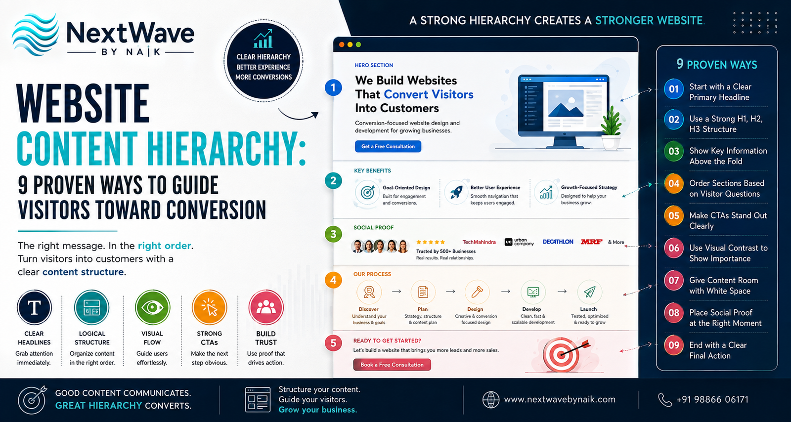
What Is Website Content Hierarchy?
Website Content Hierarchy refers to the order and importance of content elements on a webpage.
It determines:
- What visitors notice first
- What information appears next
- Which sections receive the most attention
- Where CTAs are placed
- How quickly users understand the offer
- Whether the page feels clear or confusing
A good hierarchy guides users naturally.
For example, a strong service page may follow this order:
- Clear headline
- Short supporting message
- Primary CTA
- Key benefits
- Social proof
- Service details
- Process
- FAQs
- Final CTA
This is not accidental.
The page is designed to answer the visitor’s questions in the order they are most likely to ask them.
Why Website Content Hierarchy Matters for Conversion
Visitors often decide within seconds whether a page feels relevant.
If the most important message is buried, the page becomes harder to understand.
Common problems include:
- Too many competing headlines
- Important content placed too low
- Weak visual emphasis
- CTAs hidden between long text blocks
- Repeated information
- Poor section order
- Too much information above the fold
A clear website content structure helps solve these issues.
The better the structure, the easier it becomes for visitors to move from:
Attention → Understanding → Trust → Action
That is the core goal of a conversion-focused website.
9 Proven Ways to Improve Website Content Hierarchy
1. Start With One Clear Primary Headline
The headline is usually the first major content element a visitor reads.
It should explain the page clearly.
Avoid vague headlines such as:
Welcome to Our Website
or:
Solutions for a Better Future
These do not tell the visitor enough.
A stronger headline might be:
Website Development for Small Businesses That Need More Enquiries
This immediately explains:
- What the service is
- Who it is for
- What benefit it offers
A strong headline hierarchy improves Website Content Hierarchy because it establishes the page’s main message before introducing secondary information.
Good headline rules
Your primary headline should:
- Be easy to understand
- Match the visitor’s intent
- Focus on one main message
- Avoid unnecessary jargon
- Support the next section
The headline should not compete with multiple other oversized text blocks.
2. Use a Clear H1, H2, and H3 Structure
Headings should create visible content levels.
The H1 should represent the main topic.
H2 headings should introduce major sections.
H3 headings should explain supporting points.
For example:
H1
Website Development Services for Growing Businesses
H2
Why Your Website Needs a Conversion Strategy
H3
Clear Calls to Action
H3
Fast Mobile Experience
H3
Trust-Building Content
This improves both readability and website design hierarchy.
Users can scan the page and understand its structure without reading every sentence.
Search engines also benefit from logically organized content.
3. Put the Most Important Information Above the Fold
The area visible before scrolling is extremely important.
Visitors should not need to search for basic information.
The above-the-fold section should usually include:
- Main headline
- Supporting sentence
- Primary CTA
- Relevant visual
- One strong trust or value signal
For example:
Headline:
Grow Your Business With a Website Built to Convert
Supporting text:
Conversion-focused website development for local and growing businesses.
CTA:
Get a Free Consultation
This creates an immediate path.
A strong Website Content Hierarchy makes the first screen useful, not overloaded.
4. Order Sections Based on Visitor Questions
The page should answer questions in a logical order.
Visitors often think like this:
- What is this?
- Is it relevant to me?
- Why should I care?
- Can I trust this business?
- How does it work?
- What does it cost?
- What should I do next?
Your page structure should follow a similar sequence.
A useful website content structure might look like:
- Hero section
- Benefits
- Social proof
- Service explanation
- Process
- Pricing or packages
- FAQs
- Final CTA
If trust information appears too late, visitors may leave before they feel confident.
If pricing appears too early without context, visitors may focus only on cost.
The right order supports better conversion.
5. Make CTAs Visually Important
A CTA should not look like ordinary text.
It should clearly stand out.
Common CTA examples include:
- Book a Consultation
- Get a Quote
- Start Your Project
- Talk to Our Team
- View Pricing
- Shop Now
A strong conversion-focused website usually includes a primary CTA that appears consistently across key sections.
CTA placement ideas
Place CTAs:
- In the hero section
- After a benefits section
- After testimonials
- After pricing
- At the end of the page
Do not place too many different CTA types on the same page.
If one section says:
“Book a Call”
another says:
“Download Now”
and another says:
“Send a Message”
the user may become unsure which action matters most.
Hierarchy means deciding which action is primary.
6. Use Visual Contrast to Show Importance
Content hierarchy is not created only through headings.
Visual design also matters.
You can show importance using:
- Font size
- Font weight
- Spacing
- Contrast
- Background blocks
- Buttons
- Icons
- Images
- Section separation
For example:
A bold heading with strong spacing will naturally attract more attention than a small paragraph.
A bright CTA on a simple background will stand out more than a CTA surrounded by many competing elements.
This is where website design hierarchy and website UX strategy work together.
The visual system should make the priority of each element obvious.
7. Use White Space to Improve Focus
White space is the empty space around content elements.
It helps visitors process information.
Crowded pages make everything feel equally important.
When every element is large, bright, and close together, the eye has nowhere to rest.
A strong Website Content Hierarchy uses spacing to separate:
- Headline from body copy
- Sections from one another
- Benefits from features
- Testimonials from CTAs
- Primary content from supporting details
White space also creates a more premium and professional feel.
More content does not always mean better communication.
Sometimes, removing clutter improves clarity more than adding new sections.
8. Use Social Proof at the Right Moment
Social proof is most effective when it appears close to moments of doubt.
Useful social proof includes:
- Customer reviews
- Client logos
- Ratings
- Testimonials
- Case studies
- Certifications
- Project results
Do not place all trust signals at the bottom of the page.
Instead, distribute them strategically.
For example:
After introducing the service, show client logos.
After explaining the benefits, show testimonials.
Before the final CTA, show a case study or review.
This supports a stronger website UX strategy because reassurance appears when the visitor needs it.
9. End With a Clear Final Action
Every conversion-focused page should end with direction.
A visitor who reaches the bottom of the page has already shown significant interest.
Do not leave them with a generic footer and no next step.
Use a final CTA section such as:
Ready to Build a Website That Converts?
Book a Free Consultation
or:
Need Help Improving Your Website Structure?
Talk to Our Team
The final section should summarize the value and make the next step easy.
This completes the Website Content Hierarchy by moving the visitor from information to action.
How Visual Flow Affects Website UX
Visual flow describes the order in which users naturally view a page.
Strong visual flow uses:
- Clear headings
- Directional spacing
- Images
- CTA placement
- Contrast
- section rhythm
Poor visual flow forces the user to search for meaning.
For example, if the CTA appears before the page explains the offer, it may feel premature.
If the testimonial appears before the visitor understands the service, the proof may feel disconnected.
Good website UX strategy aligns visual flow with the user’s decision-making process.
Website Content Hierarchy for Service Pages
Service pages should prioritize clarity and trust.
A useful structure may be:
1. Hero
What the service is and who it helps.
2. Benefits
What outcomes customers can expect.
3. Trust Signals
Why the business is credible.
4. Service Details
What is included.
5. Process
How the service works.
6. FAQs
Answer objections.
7. CTA
Give the next step.
This structure supports a stronger conversion-focused website because each section prepares the visitor for the next one.
Website Content Hierarchy for E-Commerce Pages
Product pages need a different structure.
A good product hierarchy may include:
- Product name
- Product image
- Price
- Main benefit
- Add-to-cart button
- Reviews
- Key features
- Delivery information
- FAQs
- Related products
The most important buying information should appear first.
Do not hide price, delivery, or product availability too far down the page.
Strong website content structure reduces friction.
Common Website Content Hierarchy Mistakes
Too Many Headings Competing for Attention
If every headline is large, none of them feels important.
Weak CTA Visibility
Visitors may understand the page but still not know what to do next.
Long Text Blocks
Large paragraphs reduce scanability.
Poor Section Order
Important proof or information may appear too late.
Inconsistent Typography
Changing fonts, sizes, and styles too often weakens hierarchy.
Overloaded Hero Sections
Too many messages above the fold create confusion.
Repeating the Same Information
Repetition makes pages feel longer without adding value.
Ignoring Mobile Layout
Hierarchy must work on small screens too.
Website Content Hierarchy and Mobile UX
Mobile users see less content at one time.
This makes hierarchy even more important.
On mobile:
- Keep headlines shorter
- Reduce unnecessary text
- Use clear section spacing
- Make CTA buttons easy to tap
- Avoid oversized images
- Keep important information near the top
- Stack content logically
A desktop page may look organized while the mobile version feels cluttered.
Always review the page on multiple screen sizes.
How Website Content Hierarchy Supports SEO
Content hierarchy also helps search engines understand page structure.
Clear headings can reinforce topic relevance.
Logical sections help organize content around related themes.
Strong hierarchy supports:
- Better readability
- Better scanning
- Clear topical structure
- Better user engagement
- Lower confusion
SEO and UX should not be treated separately.
A page that is easier for visitors to understand is often also easier for search engines to interpret.
Website Content Hierarchy Checklist
Before publishing a page, check that:
- There is one clear H1
- The main message appears immediately
- H2s divide major sections
- H3s support detailed points
- The hero includes a primary CTA
- Important information appears early
- Content sections follow visitor questions
- CTAs are visually distinct
- Social proof appears near decision points
- White space improves readability
- Font sizes show clear priority
- Mobile hierarchy is easy to scan
- The final section includes a strong CTA
- Supporting information does not compete with the main message
Conclusion
Strong websites do not simply contain information. They guide visitors through information.
That is the purpose of Website Content Hierarchy.
By organizing headlines, page sections, CTAs, social proof, visual emphasis, and information priority in the right order, businesses can create a clearer and more conversion-focused website.
A strong website content structure helps visitors understand the offer faster. A thoughtful website UX strategy reduces confusion. A clear website design hierarchy directs attention toward the most important actions.
The goal is simple:
Make the right information easy to see at the right moment.
When visitors understand what matters, why it matters, and what they should do next, the path to conversion becomes much easier.
Ready to turn blogging into a powerful SEO growth engine for your business?
At NextWave By Naik, we specialize in creating data-driven blogging strategies that improve rankings, attract organic traffic, and build long-term authority. From keyword research to content creation and optimization, we handle everything—so you can focus on growing your business.