
Multi-Step Forms vs Single-Step Forms: Which Generates More Qualified Leads?
Website forms look simple, but they can have a major impact on lead quality and conversion performance.
A visitor may be interested in your service, product, consultation, or quotation, but the way your form is designed can determine whether that person completes the enquiry or leaves halfway through.
This creates an important question for businesses:
Should you use a short single-page form, or should you divide the process into Multi-Step Forms?
There is no universal answer.
The right choice depends on the complexity of the offer, the amount of information required, the visitor’s level of intent, and how much qualification is needed before the sales team responds.
A strong website form optimization strategy balances two things:
- Making the form easy enough to complete
- Collecting enough information to generate useful, qualified leads
This guide compares Multi-Step Forms and single-step forms, explains their strengths and weaknesses, and shows when each type works best for lead generation forms, conversion form design, and better contact form UX.
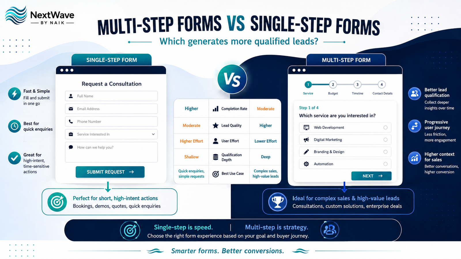
What Are Multi-Step Forms?
Multi-Step Forms divide a longer form into several smaller stages.
Instead of showing ten or fifteen fields on one screen, the form may show only two or three questions at a time.
For example:
Step 1
What service are you interested in?
Step 2
What is your approximate budget?
Step 3
When do you want to start?
Step 4
Name, phone number, and email
The visitor completes one stage before moving to the next.
Progressive forms may also display:
- Progress bars
- Step numbers
- Completion percentages
- Previous and Next buttons
The purpose is to make a long information-gathering process feel easier and more manageable.
What Are Single-Step Forms?
A single-step form displays all required fields on one screen.
For example:
- Name
- Phone
- Service
- Message
- Submit
The visitor can see the entire form immediately.
Single-step forms work especially well when only a small amount of information is required.
They are commonly used for:
- Contact enquiries
- Newsletter subscriptions
- Call-back requests
- Simple quotations
- Appointment requests
- Download forms
A short single-step form can provide excellent contact form UX because the visitor understands immediately what information is required.
Multi-Step Forms vs Single-Step Forms: The Main Difference
The biggest difference is not the number of questions.
It is how the user experiences those questions.
A 12-field form displayed on one page can feel long and demanding.
The same 12 questions divided into four stages may feel easier because the visitor only sees a small task at each step.
This is based on the idea of reducing perceived effort.
However, adding steps to a simple three-field form would create unnecessary friction.
Good conversion form design therefore requires matching form complexity with user intent.
When Multi-Step Forms Work Better
1. When You Need More Lead Information
Some businesses need more than a name and phone number.
For example, a website development agency may need to know:
- Business type
- Required service
- Current website status
- Budget range
- Timeline
- Main objective
- Contact information
Displaying every question immediately can make the form look intimidating.
Multi-Step Forms allow businesses to collect the same information progressively.
This can make detailed lead qualification feel easier.
2. When Lead Quality Matters More Than Lead Volume
Not every enquiry is valuable.
If a sales team spends large amounts of time speaking with people who:
- Have no budget
- Need an unrelated service
- Are outside the service area
- Are not ready to buy
- Do not meet eligibility criteria
the lead-generation process becomes inefficient.
A well-designed Multi-Step Forms process can ask qualification questions before collecting final contact details.
For example:
What service do you need?
→ Website Development
What is your budget?
→ ₹50,000–₹1,00,000
When do you want to start?
→ Within 30 days
This gives the sales team useful context before the conversation begins.
3. When the Service Is Complex
Complex services often require more information before a useful quotation or consultation can be provided.
Examples include:
- Website development
- Software projects
- Real estate
- Insurance
- Financial services
- Education admissions
- Business consulting
- B2B services
In these situations, Multi-Step Forms can guide visitors through a structured qualification process.
Each question helps determine the next appropriate step.
4. When Personalization Is Important
Progressive forms can adjust based on previous answers.
For example:
What do you need?
If the visitor chooses:
E-commerce Website
the next step might ask:
- Number of products
- Payment gateway requirement
- Delivery locations
If the visitor chooses:
Corporate Website
different questions can appear.
This creates a more relevant experience.
Conditional form logic can make lead generation forms more useful for both users and sales teams.
5. When You Want to Reduce the Visual Length of the Form
Long forms often look more difficult than they actually are.
Dividing the form into sections can reduce this psychological barrier.
Instead of seeing:
15 fields
the visitor may see:
Step 1 of 4
with only three questions.
A progress indicator also shows that the process has a clear end.
This can improve perceived simplicity.
When Single-Step Forms Work Better
1. When the Form Is Already Short
If you only need:
- Name
- Phone number
there is little reason to create multiple steps.
A single-step form is faster and clearer.
Adding Next and Previous buttons would increase effort unnecessarily.
For simple enquiries, a short form often provides better contact form UX.
2. When Visitors Have High Intent
Someone clicking:
Book Now
or:
Request a Callback
may already know what they want.
Forcing them through several stages can slow down the conversion.
High-intent pages often benefit from direct forms.
Examples include:
- Appointment pages
- Contact pages
- Call-back requests
- Demo requests
- Event registrations
If the visitor is ready to act, make the action easy.
3. When Speed Is More Important Than Qualification
Some businesses want maximum enquiry volume first and qualification later.
For example, a local salon may simply need:
- Name
- Phone
- Preferred service
The team can ask additional questions through WhatsApp or phone.
In this case, a short single-step form may generate more enquiries.
4. When Users Need to See All Requirements
Sometimes showing every field upfront is useful.
For example, a user may want to know exactly what information is needed before beginning.
A single-step form provides full transparency.
This can work well for simple applications or forms where the required information is predictable.
Which Form Generates More Leads?
The answer depends on the situation.
A short single-step form can often generate more raw submissions because it requires less effort.
However, Multi-Step Forms may produce more qualified leads because they collect useful information before the enquiry reaches sales.
This creates an important distinction:
More leads does not always mean better results.
Imagine two forms.
Form A: Single-Step
100 enquiries
30 qualified leads
5 customers
Form B: Multi-Step
70 enquiries
45 qualified leads
10 customers
Form A generated more enquiries.
But Form B generated better business results.
When evaluating lead generation forms, businesses should measure:
- Form completion rate
- Qualified lead rate
- Cost per qualified lead
- Lead-to-sale conversion
- Revenue generated
Do not judge success only by submission volume.
9 Factors That Should Decide Your Form Type
1. Number of Fields
For three to five simple fields, a single-step form is usually sufficient.
As the number of fields grows, Multi-Step Forms may create a better experience.
2. Complexity of the Offer
Simple offers require simple forms.
Complex offers may require progressive qualification.
3. Lead Qualification Requirements
If sales needs detailed information before responding, a multi-step structure can help.
4. Visitor Intent
High-intent users usually need fewer barriers.
Lower-intent visitors may benefit from a guided process.
5. Mobile Experience
Long forms can be especially frustrating on smartphones.
Website form optimization should always include mobile testing.
Multiple short stages may feel easier than one long mobile form.
6. Sales-Team Capacity
If the sales team receives more leads than it can handle, qualification becomes more important.
A detailed form can reduce low-quality enquiries.
7. Traffic Source
Traffic from a highly targeted campaign may already be qualified.
Broader social-media traffic may require more filtering.
Different landing pages can use different form strategies.
8. Privacy Sensitivity
Do not ask for highly personal or unnecessary information too early.
Visitors may hesitate if the form immediately requests:
- Detailed financial information
- Exact budget
- Business revenue
- Sensitive personal information
Ask only what is necessary.
9. Conversion Goal
The best conversion form design depends on the desired outcome.
A newsletter subscription and a B2B consultation should not use the same form strategy.
Best Practices for Multi-Step Forms
Keep Each Step Short
Try to keep each screen focused.
For example:
Step 1
Service Requirement
Step 2
Project Details
Step 3
Budget and Timeline
Step 4
Contact Details
Do not simply divide a long form randomly.
Each stage should have a clear purpose.
Show Progress
Use indicators such as:
Step 2 of 4
or:
50% Complete
This gives users a sense of progress.
Without an indicator, visitors may worry that the form will continue indefinitely.
Start With Easy Questions
Do not begin with the most difficult question.
Start with something simple.
For example:
What service are you looking for?
This is easier than immediately asking:
What is your annual marketing budget?
Once visitors begin the form, they may be more willing to continue.
Ask Contact Details Later
In many Multi-Step Forms, it can be effective to collect simple qualification information first and contact details near the end.
By that stage, the visitor has already invested effort in completing the form.
However, always test this approach for your audience.
Allow Users to Go Back
Visitors should be able to correct previous answers.
Include a clear Previous or Back option.
Preserve Entered Data
If a user returns to the previous step, their answers should remain.
Losing completed information creates unnecessary frustration.
Best Practices for Single-Step Forms
Keep Fields Minimal
Every additional field creates another decision.
Ask only for information you genuinely need.
Use Clear Labels
Avoid vague labels.
Instead of:
Details
use:
Tell us what service you need
Avoid Placeholder-Only Labels
Field labels should remain visible after the user starts typing.
This improves usability.
Use the Right Input Types
For example:
- Phone fields for phone numbers
- Email fields for email
- Dropdowns for fixed options
- Date selectors for appointments
This improves mobile usability.
Use Strong CTA Copy
Avoid:
Submit
when a more useful CTA is available.
Try:
- Request My Quote
- Book My Consultation
- Get a Callback
- Start My Project
- Check Availability
Good CTA language improves conversion form design.
How to Improve Contact Form UX
Whether you choose a multi-step or single-step format, strong contact form UX should remain the priority.
A good form should:
- Load quickly
- Work on mobile
- Use readable labels
- Show errors clearly
- Avoid unnecessary questions
- Protect customer information
- Confirm successful submission
- Explain what happens next
For example:
Thanks! Our team will contact you within one business day.
This is better than simply displaying:
Form submitted.
It sets expectations and reduces uncertainty.
Form Validation Should Help, Not Frustrate
Errors should be specific.
Weak error:
Invalid input.
Better error:
Please enter a valid 10-digit mobile number.
Validation should happen as early as practical without interrupting the user unnecessarily.
Never delete the entire form because one field contains an error.
Multi-Step Forms and Mobile Users
Mobile deserves special attention because long forms can become difficult on small screens.
For mobile Multi-Step Forms:
- Keep each screen short
- Use large buttons
- Reduce typing
- Use dropdowns carefully
- Use appropriate keyboards
- Avoid tiny progress indicators
- Test autofill
- Make Next buttons easy to reach
A form that works well on desktop may still perform poorly on mobile.
Should You Use Conditional Logic?
Conditional logic can significantly improve website form optimization.
Instead of asking every visitor the same questions, show only relevant fields.
For example:
Do you already have a website?
If Yes:
Enter your website URL.
If No:
skip that question.
Conditional logic reduces unnecessary fields and makes forms feel more personalized.
Measure Form Drop-Off by Step
One major advantage of Multi-Step Forms is that businesses can identify exactly where visitors stop.
For example:
Step 1
90% continue
Step 2
82% continue
Step 3
45% continue
Step 4
42% complete
This tells you that Step 3 may contain a problem.
Maybe:
- The questions are too difficult
- Budget options feel uncomfortable
- There are too many fields
- The wording is unclear
This insight allows targeted improvements.
Test Instead of Assuming
The best answer to:
Multi-Step Forms or single-step forms?
is often:
Test both.
Run an A/B test where possible.
Measure:
- Form starts
- Completion rate
- Qualified lead rate
- Cost per lead
- Sales conversion
- Revenue per lead
A form with a lower completion rate may still be more profitable if the leads are significantly better.
Multi-Step Forms for B2B Businesses
B2B companies often benefit from progressive forms because they need more qualification.
A B2B form might ask:
- Service required
- Company size
- Current challenge
- Budget
- Timeline
- Contact information
This helps sales prioritize enquiries.
It can also allow automated routing.
For example:
High-budget leads → Senior sales team
Small projects → Standard sales queue
Support requests → Customer service
This improves operational efficiency.
Single-Step Forms for Local Businesses
Local service businesses may benefit from simplicity.
For example, a salon enquiry could ask:
- Name
- Phone
- Service
- Preferred date
A restaurant booking may only need:
- Name
- Phone
- Date
- Time
- Number of guests
A multi-stage process would probably create unnecessary friction.
The form should match the complexity of the customer’s decision.
Common Form Optimization Mistakes
Asking Too Much Too Early
Only collect information that contributes to the next business step.
Using the Same Form Everywhere
Different pages and audiences may need different forms.
Ignoring Mobile
A large percentage of users may complete forms on phones.
No Progress Indicator
Long progressive forms should show how much remains.
Poor Error Messages
Tell visitors exactly what needs correction.
Weak CTA Text
Use an action that describes what the visitor receives.
Measuring Only Submissions
Track lead quality and sales results too.
Multi-Step Forms vs Single-Step Forms Checklist
Use Multi-Step Forms when:
- You require several fields
- Qualification matters
- The service is complex
- The sales team needs detailed context
- Conditional logic can personalize the journey
- The process naturally has several stages
Use a single-step form when:
- The form is short
- The action is simple
- Visitors have high intent
- Speed matters
- Qualification can happen later
- Only basic contact information is needed
Conclusion
There is no single form type that always wins.
Short single-step forms can be excellent for fast, simple enquiries. They minimize friction and make it easy for high-intent visitors to take action.
Multi-Step Forms, on the other hand, can make longer qualification processes feel more manageable and help businesses collect better information before leads reach the sales team.
The right lead generation forms should balance visitor effort with business requirements.
Strong website form optimization means asking the right questions, at the right time, in the simplest possible way.
Whether you choose a single-page form or progressive Multi-Step Forms, measure more than completion rate.
Track qualified leads, sales conversions, and revenue.
Because the best conversion form design is not necessarily the one that generates the most submissions.
It is the one that generates the right leads while delivering a smooth contact form UX.
Ready to turn blogging into a powerful SEO growth engine for your business?
At NextWave By Naik, we specialize in creating data-driven blogging strategies that improve rankings, attract organic traffic, and build long-term authority. From keyword research to content creation and optimization, we handle everything—so you can focus on growing your business.