
The Festival Offer-Page Checklist: Speed, Scarcity, Trust and Frictionless Checkout
Festival seasons create some of the biggest sales opportunities for online businesses. Customers are actively searching for discounts, gifts, limited-edition products, and time-sensitive deals. However, increased buying intent does not automatically guarantee more conversions.
A campaign may attract thousands of visitors, but a confusing, slow, or untrustworthy offer page can still cause potential customers to leave without purchasing.
A successful Festival Offer Landing Page must do more than display a discount. It should load quickly, communicate urgency, establish credibility, simplify product selection, and make checkout effortless.
This checklist explains the essential elements every festive campaign page needs to convert seasonal traffic into completed orders.
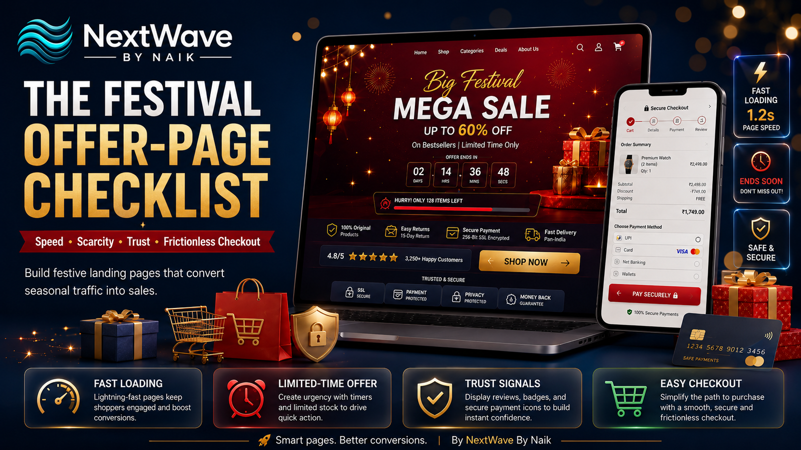
What Is a Festival Offer Landing Page?
A Festival Offer Landing Page is a dedicated webpage created specifically for a festival promotion, seasonal discount, or limited-time sales campaign.
Unlike a standard product or category page, it is designed around one clear campaign objective, such as:
- Promoting a festive discount
- Selling a special product bundle
- Generating enquiries
- Collecting leads
- Increasing online orders
- Driving customers toward a limited-time deal
A well-designed festive page removes unnecessary distractions and directs visitors toward one primary action.
That action could be:
- Shop the Sale
- Claim the Offer
- Buy Now
- Get the Festive Deal
- Book Before the Offer Ends
- Apply the Coupon
The more focused the page is, the easier it becomes for visitors to understand the offer and take action.
Why Festival Offer Pages Often Lose Conversions
Festival campaigns usually bring a sudden increase in website traffic. During this period, businesses compete heavily for customer attention.
Potential buyers may open several websites at the same time and compare:
- Prices
- Discounts
- Delivery timelines
- Reviews
- Return policies
- Product quality
- Payment options
- Brand credibility
Even a small amount of confusion can make them choose a competitor.
Common problems affecting a festive sale website include:
- Slow loading speed
- Complicated discount conditions
- Poor mobile design
- Hidden charges
- Weak calls to action
- Unclear delivery information
- Too many checkout steps
- Missing customer reviews
- Untrustworthy payment pages
The purpose of a dedicated offer page is to remove these obstacles before they affect the buying decision.
The Complete Festival Offer-Page Checklist
1. Create a Clear and Specific Festival Offer
Visitors should understand the offer within the first few seconds of landing on the page.
Avoid vague headlines such as:
“Festival Sale Is Live”
Instead, communicate the exact benefit:
“Get Up to 40% Off This Festive Season”
or:
“Buy Two, Get One Free—Offer Ends Sunday”
Your main offer section should clearly explain:
- The discount or benefit
- The eligible products or services
- The campaign end date
- Any coupon code required
- The main action customers should take
A clear offer prevents visitors from having to search through the page to understand what they will receive.
Effective headline structure
A strong festival headline usually combines:
Occasion + benefit + urgency
For example:
“Celebrate Diwali with 30% Off—Shop Before Midnight”
This immediately tells visitors what the offer is, why it is relevant, and when it ends.
2. Make Page Speed a Priority
Speed is one of the most important elements of a high-performing Festival Offer Landing Page.
Festival traffic can place additional pressure on website servers. At the same time, customers may be browsing through mobile networks, shared Wi-Fi, or slower internet connections.
If the offer page takes too long to load, visitors may leave before seeing the campaign.
Improve festive page speed by:
- Compressing product and banner images
- Using modern image formats such as WebP
- Removing unnecessary animations
- Limiting heavy scripts and plugins
- Enabling browser caching
- Using a reliable hosting provider
- Testing the page on mobile networks
- Avoiding autoplay background videos
Visual effects can make a campaign look attractive, but they should never reduce usability.
A lightweight page that loads quickly will usually outperform an overly animated page that delays access to the offer.
3. Design for Mobile-First Shopping
A large portion of festive shoppers will discover your campaign through Instagram, Facebook, WhatsApp, Google Ads, or email on their phones.
Your limited-time offer page should therefore be designed for mobile users first.
Check whether:
- The headline is readable without zooming
- Product images fit correctly
- Buttons are easy to tap
- The offer information appears above the fold
- The coupon code can be copied easily
- Forms are short and simple
- Checkout works smoothly on mobile
- Payment options open correctly
- Pop-ups do not cover the entire screen
A page may look excellent on a laptop but still perform poorly if the mobile experience feels crowded or difficult.
4. Use Scarcity Honestly
Scarcity encourages customers to act before an opportunity disappears. It is especially effective during festival promotions because shoppers expect deals to be temporary.
Useful scarcity elements include:
- Countdown timers
- Offer expiry dates
- Limited stock indicators
- Early-bird prices
- Limited festive bundles
- Delivery cut-off dates
- First-come, first-served bonuses
For example:
“Offer Ends in 08 Hours”
“Only 12 Festive Gift Boxes Left”
“Order Before October 18 for Pre-Diwali Delivery”
These messages help customers understand why they should act now rather than return later.
However, scarcity must be genuine. A countdown timer that restarts every time the page is opened can damage customer trust.
The goal is to communicate real urgency, not create artificial pressure.
5. Keep the Call to Action Clear and Consistent
Every section of your Festival Offer Landing Page should guide visitors toward one primary action.
Strong call-to-action examples include:
- Shop the Festive Sale
- Claim Your Discount
- Get the Festival Bundle
- Buy Before the Offer Ends
- Unlock the Deal
- Order Now
- Book Your Festive Slot
Avoid using several competing calls to action such as “Learn More,” “Contact Us,” “Subscribe,” and “Shop Now” in the same area.
The primary button should:
- Use action-oriented language
- Be visually prominent
- Appear more than once on long pages
- Remain consistent throughout the page
- Lead directly to the next purchase step
Customers should never have to wonder where to click.
6. Display the Final Price Clearly
Discounts can attract attention, but confusing pricing creates hesitation.
Show the original price, discounted price, and total savings clearly.
For example:
Original Price: ₹2,499
Festival Price: ₹1,799
You Save: ₹700
Also explain whether:
- Taxes are included
- Delivery is free
- A coupon code is required
- The discount applies automatically
- Minimum order value conditions apply
- Cash on delivery is available
Unexpected costs during checkout are one of the biggest sources of purchase abandonment.
A transparent festive sale website builds confidence before customers reach the payment stage.
7. Add Strong Trust Signals
Festival shoppers may discover your brand for the first time through an advertisement. Before purchasing, they need reassurance that the business is genuine and reliable.
Trust signals can include:
- Verified customer reviews
- Star ratings
- Customer photographs
- Video testimonials
- Secure payment badges
- Cash-on-delivery availability
- Return or replacement policies
- Business contact details
- Social media links
- Years of experience
- Number of customers served
- Client or partner logos
Place trust signals close to important decision points, especially near:
- Product prices
- Buy-now buttons
- Forms
- Checkout buttons
- Payment sections
Do not hide all your credibility elements at the bottom of the page.
Trust should appear exactly where customer doubt is most likely to occur.
8. Use Real Customer Reviews
Reviews provide the social proof customers need when evaluating an unfamiliar product or business.
The most effective reviews are specific.
Instead of:
“Excellent product.”
Use a review such as:
“The gift box arrived before Diwali, the packaging looked premium, and every item was packed securely.”
Specific feedback feels more believable and helps answer practical questions.
Where possible, include:
- Customer name
- Customer image
- Verified purchase label
- Product purchased
- Date of review
- Star rating
Customer videos and user-generated images can make a limited-time offer page feel even more trustworthy.
9. Explain Delivery Timelines
Festival purchases are often connected to a specific event, celebration, or gifting date. Delivery information can therefore directly influence the buying decision.
Clearly mention:
- Estimated delivery period
- Last date for festival delivery
- Same-day or express delivery availability
- Locations covered
- Shipping charges
- Tracking availability
A message such as:
“Order by October 15 to receive your package before Diwali”
can reduce uncertainty and create additional urgency.
Never promise delivery timelines your business cannot consistently meet.
10. Keep Forms Short
When the campaign goal is lead generation or appointment booking, avoid asking for too much information.
A high-converting festive enquiry form may only need:
- Name
- Phone number
- Email address
- Preferred service or product
- Location, when necessary
Long forms create friction, particularly on mobile devices.
Collect only the information required to take the next step. Additional details can be requested later through a call, email, or WhatsApp conversation.
The button below the form should also describe the outcome clearly.
Instead of “Submit,” use:
- Get My Festive Quote
- Claim the Offer
- Request a Callback
- Reserve My Slot
- Unlock My Discount
11. Simplify Product Selection
Festival sales sometimes fail because customers are shown too many options.
A dedicated offer page should help visitors decide quickly.
Consider organising products into simple groups, such as:
- Best Festive Deals
- Gifts Under ₹999
- Premium Gift Sets
- Family Combos
- Limited-Edition Products
- Most Popular Choices
You can also highlight one product as:
- Best Seller
- Most Gifted
- Customer Favourite
- Best Value
- Limited Festival Edition
Clear product grouping reduces decision fatigue and moves customers closer to checkout.
12. Create a Frictionless Checkout
The quality of your campaign page will not matter if checkout is complicated.
Improving checkout conversion requires removing unnecessary steps between the offer and payment.
A frictionless checkout should include:
- Guest checkout
- Minimal form fields
- Auto-filled address details
- Clear order summary
- Multiple payment methods
- Easy coupon application
- Visible delivery fees
- Mobile-friendly payment options
- Secure payment assurance
- Clear error messages
Allow customers to pay using familiar methods such as:
- UPI
- Credit and debit cards
- Net banking
- Mobile wallets
- Cash on delivery, where suitable
The fewer decisions customers must make during checkout, the more likely they are to complete the order.
13. Make Coupon Codes Easy to Use
Coupon-related confusion can quickly damage campaign performance.
When a coupon is required:
- Display it prominently
- Add a copy-code button
- Mention where to apply it
- Explain eligibility conditions
- Confirm when the code has been applied
- Show the updated total immediately
An even better option is to apply the discount automatically when visitors arrive through the campaign link.
This reduces friction and supports higher checkout conversion.
14. Add a Frequently Asked Questions Section
An FAQ section helps answer final objections before customers leave the page.
Useful festive sale questions include:
- When does the offer end?
- Is the discount applied automatically?
- Can this offer be combined with another coupon?
- Is cash on delivery available?
- When will my order arrive?
- Can festive products be returned?
- Is gift wrapping included?
- Which locations are eligible?
- What happens if an item is damaged?
- How can I contact support?
Keep each answer direct, transparent, and easy to scan.
15. Provide Immediate Customer Support
Some customers need quick clarification before making a purchase.
Offer accessible support options such as:
- WhatsApp chat
- Live chat
- Click-to-call button
- Email support
- Frequently asked questions
- Chatbot assistance
During major campaigns, clearly mention support hours and expected response times.
For example:
“Need help choosing a gift? Chat with us on WhatsApp.”
This makes the business feel available and reduces hesitation.
16. Remove Unnecessary Navigation
A festival landing page should keep visitors focused on the promotion.
Too many menu items can lead visitors away from the offer.
Consider simplifying or removing:
- Long navigation menus
- Unrelated service links
- Excessive blog links
- Multiple promotional banners
- Competing pop-ups
- Unnecessary footer sections
Keep essential links such as:
- Contact
- Shipping policy
- Return policy
- Privacy policy
- Terms and conditions
The page should provide enough information to build confidence without distracting customers from the campaign.
17. Use High-Quality Product Visuals
Images play a major role in festive shopping, particularly when customers are buying gifts.
Use visuals that show:
- The complete product
- Product packaging
- Important details
- Size or scale
- Festive presentation
- Gift wrapping
- Product use
- Different angles
For premium products, lifestyle images can help customers imagine the gifting or usage experience.
However, keep images compressed so they do not affect page speed.
18. Track the Right Conversion Data
A Festival Offer Landing Page should be measured throughout the campaign.
Important metrics include:
- Page visits
- Page load time
- Mobile conversion rate
- Call-to-action clicks
- Add-to-cart rate
- Checkout initiation rate
- Purchase conversion rate
- Form submissions
- Coupon usage
- Cart abandonment rate
- Average order value
- Traffic source performance
Tracking these numbers helps identify where customers are dropping off.
For example:
- High traffic but low CTA clicks may indicate a weak offer.
- Strong add-to-cart activity but low purchases may indicate checkout friction.
- Poor mobile conversions may indicate a design or speed problem.
- High form abandonment may indicate too many required fields.
Campaign optimisation should continue while the offer is active, not only after it ends.
Recommended Festival Offer-Page Structure
A high-converting festive page can follow this structure:
Section 1: Hero Banner
Include:
- Festival campaign headline
- Main discount
- Offer deadline
- Clear call to action
- Strong product visual
Section 2: Best Offers
Show the most attractive products, bundles, or services first.
Section 3: Why Choose This Offer?
Communicate value, quality, convenience, or savings.
Section 4: Customer Reviews
Add ratings, testimonials, photographs, or videos.
Section 5: Trust and Delivery Information
Mention secure payments, delivery timelines, returns, support, and guarantees.
Section 6: Urgency Reminder
Repeat the deadline, stock limitation, or delivery cut-off date.
Section 7: Frequently Asked Questions
Answer common purchase objections.
Section 8: Final Call to Action
End with a direct invitation to claim the offer before it expires.
Final Festival Offer Landing Page Checklist
Before launching your campaign, confirm that:
- The offer is immediately understandable
- The page loads quickly
- The design works properly on mobile
- The campaign deadline is clearly visible
- Scarcity messages are genuine
- Pricing and savings are transparent
- Calls to action are prominent
- Customer reviews are included
- Trust badges appear near purchase buttons
- Delivery timelines are explained
- Forms contain only essential fields
- Product choices are easy to understand
- Checkout supports familiar payment options
- Coupon codes are easy to apply
- Support channels are visible
- Policies are accessible
- Tracking tools are active
- The complete checkout process has been tested
Conclusion
A successful festive campaign is not built around discounts alone. Customers also need speed, clarity, urgency, confidence, and convenience.
The best Festival Offer Landing Page combines a compelling promotion with fast performance, honest scarcity, strong social proof, transparent pricing, and a frictionless checkout experience.
Before launching your next festive sale website, review every stage from the first advertisement click to the final payment confirmation.
Reducing even one unnecessary step can improve checkout conversion, while removing doubt can turn first-time visitors into confident customers.
When the page is fast, the offer is clear, and the checkout feels effortless, your festival campaign has a much better chance of converting seasonal attention into measurable sales.
Ready to turn blogging into a powerful SEO growth engine for your business?
At NextWave By Naik, we specialize in creating data-driven blogging strategies that improve rankings, attract organic traffic, and build long-term authority. From keyword research to content creation and optimization, we handle everything—so you can focus on growing your business.