
Mobile-First Web Design: The Ultimate Guide to Preparing Your Website for Mobile-First Indexing
The digital landscape has changed dramatically over the past decade, with mobile devices becoming the primary way people browse the internet. Today, more than half of all website traffic comes from smartphones and tablets, making mobile optimization essential rather than optional. This shift has led search engines to prioritize mobile versions of websites when determining search rankings.
Mobile-First Web Design is no longer just a trend—it is a necessity for businesses that want to remain competitive online. A website that performs flawlessly on mobile devices not only improves user satisfaction but also strengthens search engine visibility, increases engagement, and drives more conversions.
Whether you operate an eCommerce store, a corporate website, or a service-based business, understanding mobile-first indexing can significantly impact your digital success. In this guide, you’ll learn how Mobile-First Web Design works, why it matters, and how to optimize your website for long-term SEO success.
What Is Mobile-First Web Design?
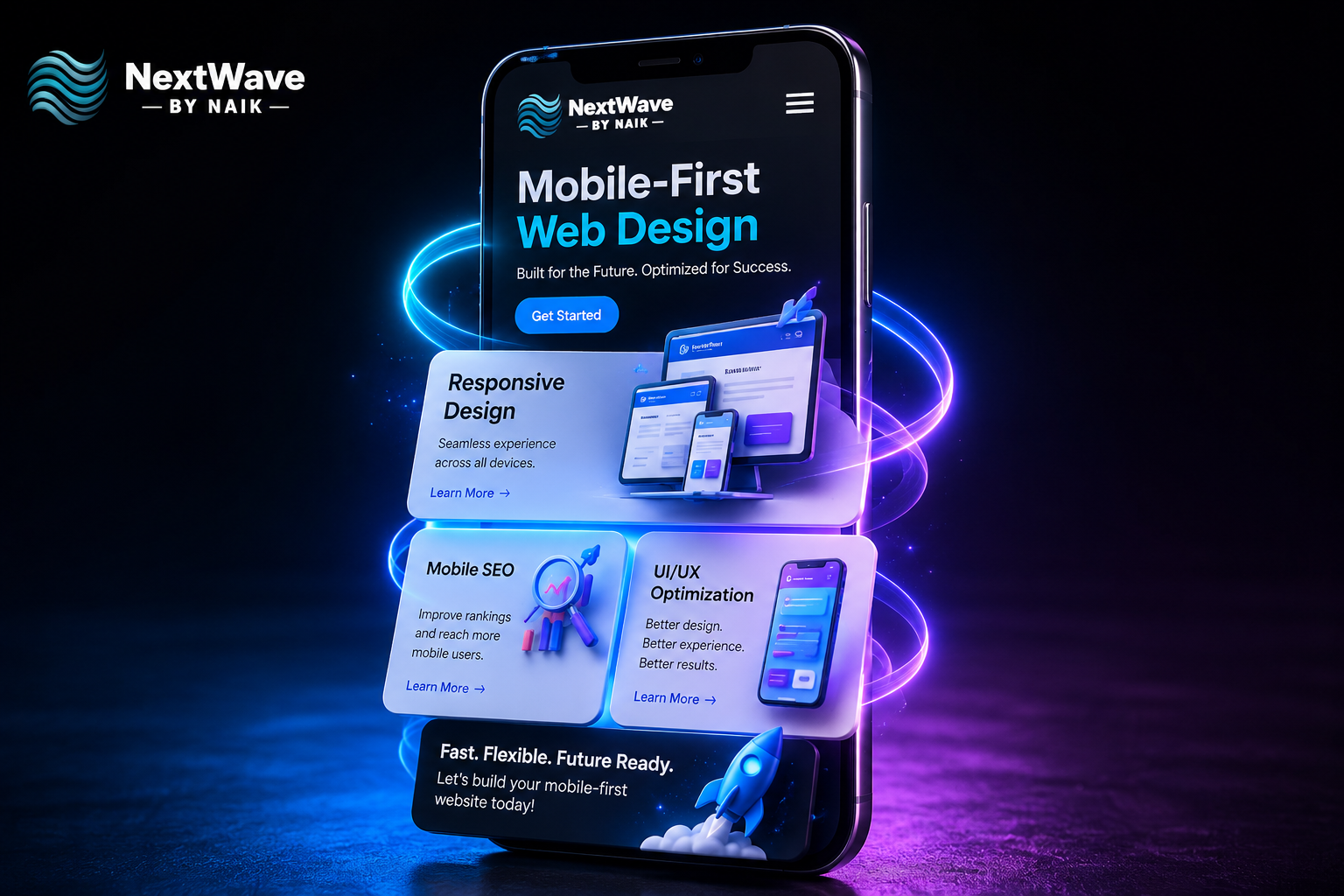
Mobile-First Web Design is an approach where designers and developers create websites for mobile devices before adapting them for desktops. Instead of shrinking a desktop website to fit smaller screens, the design process begins with smartphones and gradually expands to larger displays.
This strategy aligns perfectly with Google’s mobile-first indexing, where the search engine primarily evaluates the mobile version of a website when ranking pages.
A mobile-first website focuses on:
- Fast loading speed
- Clean navigation
- Easy readability
- Touch-friendly interfaces
- Responsive layouts
- Optimized images
- Consistent user experience
By prioritizing mobile users, businesses create websites that perform better across all devices.
Why Mobile-First Indexing Matters
Google’s mobile-first indexing means the mobile version of your website is now the primary version used for indexing and ranking.
If your website isn’t optimized for mobile users, you may experience:
- Lower search rankings
- Reduced organic traffic
- Higher bounce rates
- Poor user engagement
- Lower conversion rates
On the other hand, implementing Mobile-First Web Design improves search visibility while creating a smoother browsing experience for visitors.
Responsive Design Is the Foundation
One of the most important elements of Mobile-First Web Design is responsive design.
Responsive design automatically adjusts website layouts based on screen size, ensuring users receive a consistent experience whether they’re using a smartphone, tablet, laptop, or desktop.
Benefits include:
- Flexible page layouts
- Better accessibility
- Simplified website management
- Improved SEO performance
- Higher customer satisfaction
Instead of maintaining separate desktop and mobile websites, responsive design provides a single optimized solution.
Improve Mobile SEO for Better Rankings
Strong mobile SEO ensures search engines can properly crawl, index, and rank your mobile pages.
Key mobile SEO practices include:
Optimize Page Speed
Mobile users expect websites to load within seconds. Compress images, enable browser caching, and reduce unnecessary scripts to improve performance.
Use Mobile-Friendly Fonts
Readable fonts improve user experience without requiring visitors to zoom.
Optimize Metadata
Ensure titles, meta descriptions, and structured data remain consistent across desktop and mobile versions.
Simplify Navigation
Clear menus and intuitive layouts help visitors quickly find the information they need.
These improvements strengthen both search rankings and user engagement.
Enhance UI/UX Optimization
Great UI/UX optimization is essential for retaining visitors on mobile devices.
Consider these best practices:
Touch-Friendly Buttons
Buttons should be large enough for users to tap comfortably without accidental clicks.
Clear Content Hierarchy
Organize headings, paragraphs, and images so users can easily scan information.
Reduce Pop-Ups
Intrusive pop-ups negatively affect mobile usability and may impact search rankings.
Improve Readability
Use short paragraphs, bullet points, and sufficient white space for easier reading.
An intuitive interface encourages visitors to stay longer and explore more pages.
Optimize Mobile Website Performance
Website speed directly impacts user experience and SEO.
To improve performance:
- Compress images
- Minify CSS and JavaScript
- Enable lazy loading
- Use browser caching
- Remove unnecessary plugins
- Choose reliable hosting
- Optimize Core Web Vitals
Fast-loading websites reduce bounce rates while increasing conversions.
Common Mobile Optimization Mistakes
Many websites struggle because they overlook essential mobile optimization practices.
Avoid these common mistakes:
- Slow loading pages
- Tiny text sizes
- Unresponsive layouts
- Large image files
- Broken mobile navigation
- Hidden content on mobile
- Poor touch functionality
- Excessive advertisements
Fixing these issues significantly improves both rankings and customer satisfaction.
Best Practices for Mobile-First Web Design
To maximize your website’s performance, follow these proven strategies:
- Design for smartphones first.
- Implement responsive design across every page.
- Prioritize mobile SEO optimization.
- Improve UI/UX optimization continuously.
- Optimize website speed and Core Web Vitals.
- Use compressed images and modern file formats.
- Maintain consistent content across devices.
- Regularly test your website on multiple screen sizes.
- Monitor mobile analytics for ongoing improvements.
These practices create a seamless browsing experience while strengthening your SEO strategy.
Future Trends in Mobile-First Design
As technology evolves, Mobile-First Web Design will continue to become more sophisticated.
Emerging trends include:
- AI-powered personalization
- Voice search optimization
- Progressive Web Apps (PWAs)
- Accelerated mobile experiences
- Advanced responsive frameworks
- Enhanced accessibility standards
- Smarter user behavior analysis
Businesses that adopt these innovations early will remain competitive in search rankings and customer engagement.
Conclusion
Mobile users now dominate internet traffic, making Mobile-First Web Design one of the most important factors for modern SEO success. Websites that prioritize responsive design, mobile SEO, UI/UX optimization, and fast performance provide better user experiences while improving search engine visibility.
Preparing your website for mobile-first indexing is not simply about satisfying search engine requirements. It is about meeting customer expectations, increasing engagement, and building long-term online growth. By investing in a mobile-first strategy today, your business will be better positioned to attract more visitors, generate higher conversions, and maintain a competitive advantage in an increasingly mobile-driven digital world.